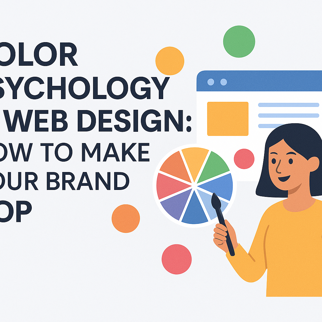
🎨 Color Psychology in Web Design: How to Make Your Brand Pop
Colors do more than make your website look pretty — they influence how people feel, behave, and remember your brand. In the world of web design, color psychology is a powerful tool to help you stand out, connect, and convert.
Whether you're a freelancer designing for clients or a business building your brand on Afriancer.com, mastering color psychology can give you a serious edge.
🌈 What Is Color Psychology?
Color psychology is the study of how different hues affect human emotions and decisions. Each color triggers specific reactions — and when used intentionally in design, those reactions can reinforce your brand's message.
🔵 Common Color Meanings in Web Design
Here’s a quick breakdown of what popular colors typically communicate:
-
Blue: Trust, professionalism, calm
-
Red: Energy, urgency, excitement
-
Green: Growth, health, stability
-
Yellow: Optimism, youth, creativity
-
Black: Luxury, sophistication, power
-
Purple: Royalty, imagination, wisdom
-
White: Cleanliness, simplicity, space
✅ Example: Banks often use blue to suggest security, while startups may use yellow to feel fun and innovative.
🧠 How to Use Color Psychology on Your Website
1. Define Your Brand Personality
Is your brand bold or minimal? Trustworthy or adventurous? Choose colors that reflect your brand tone.
2. Limit Your Palette
Stick to 2–3 main colors and 1–2 accent colors. Too many colors can overwhelm users.
3. Use Contrast for Action
Buttons and CTAs (Call-To-Actions) should stand out. Use bright or contrasting colors to draw attention to actions like “Sign Up” or “Buy Now.”
4. Think About Your Audience
Different cultures and demographics interpret colors differently. Know your target audience.
5. Stay Consistent
Use your chosen colors across all brand touchpoints: website, social media, invoices, and more.
🛠️ Tools to Choose and Test Colors
-
Coolors.co – Generate color palettes
-
Adobe Color – Explore color harmony
-
Contrast Checker – Test accessibility
-
Google Material Color Tool – For app designers
💡 Final Thought
Color isn't just decoration — it's communication. A well-chosen color scheme can guide users, boost credibility, and make your brand unforgettable.
🔥 Ready to build a site that pops?
Join Afriancer.com and find top web designers who know how to turn color into conversions.
Recent Posts